Streamlining school counselling processes — one dashboard at a time
CounselSync
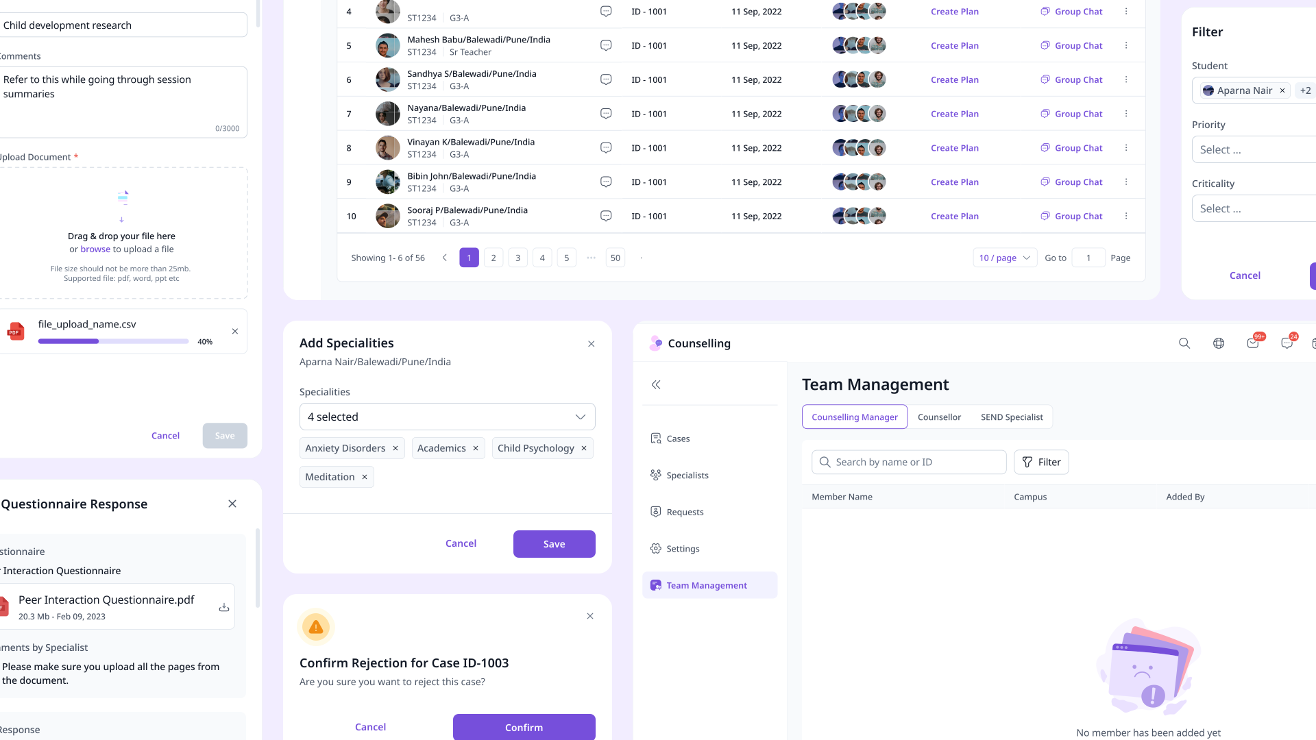
- Context
- Agency project for a long-time school client
- My Role
- Lead Product Designer:
- Strategy & Decision Making, Wireframing, Visual/UI Design
- Timeline
- 3–4 months
- Outcome
- Shipped to production — currently rolling out to schools
TL;DR
What I did and why it mattered
I inherited a stalled counselling platform with hundreds of screens and several incomplete flows, mapped the gaps across multiple user roles, designed critical missing flows from scratch, and stayed through two months of dev handoff until it shipped.
The Problem
Counsellors managing sensitive caseloads with spreadsheets and scattered files
School counsellors juggle sensitive, high-stakes caseloads every day — tracking sessions, coordinating with parents and teachers, managing consent and documentation — often with nothing more than spreadsheets and scattered files. There’s no unified view of a student’s journey, no structured way to flag who needs follow-up, and critical paperwork lives in inboxes and shared drives instead of one reliable place. CounselSync was being built to change that.
Where I Came In
Hundreds of screens, stalled mid-design, and a dev team waiting to build
CounselSync had been in progress for a while — and then the previous designer left. Flows were incomplete, edge cases were unresolved, the designs sat on a slightly outdated version of the design system, and development couldn’t move forward. I was brought in to make sense of what existed, identify what was missing, and get this across the finish line — auditing hundreds of screens, closing gaps, updating the design system, and driving toward dev handoff.
Making Sense of It All
Auditing the existing designs, mapping data flows, and finding the gaps
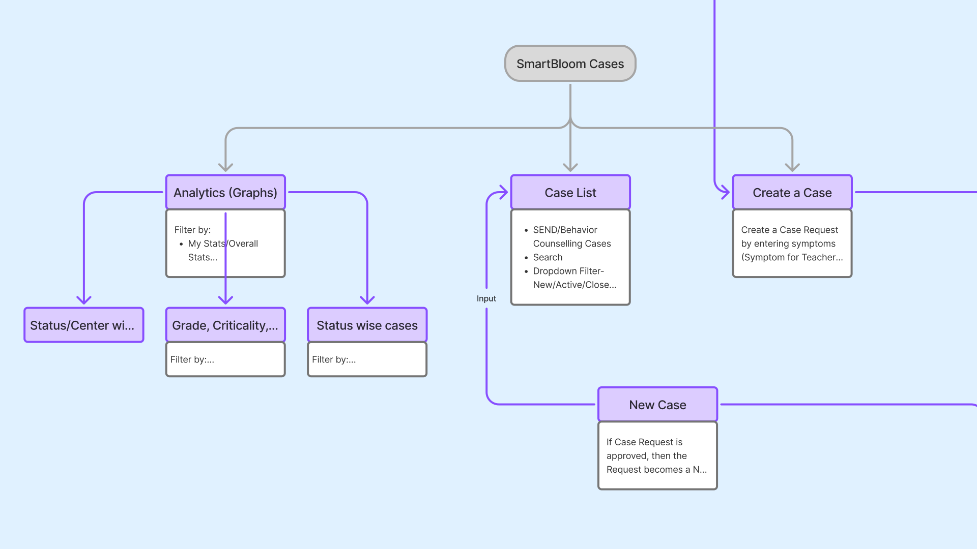
CounselSync serves multiple roles — counsellors, students, parents, teachers — each interacting with the same data differently. With several incomplete flows and no designer to ask, I needed to see the full picture fast.
I created flow diagrams mapping how data moves between roles — exposing incomplete flows, missing edge cases, and outdated design system inconsistencies along the way. I then annotated every flow with logic, gaps, and decisions — sharpening my own understanding while building ready-made documentation for the dev handoff.
> Flow diagrams mapping data across all roles
> Detailed annotations for every flow
> A clear picture of what’s broken and what’s missing
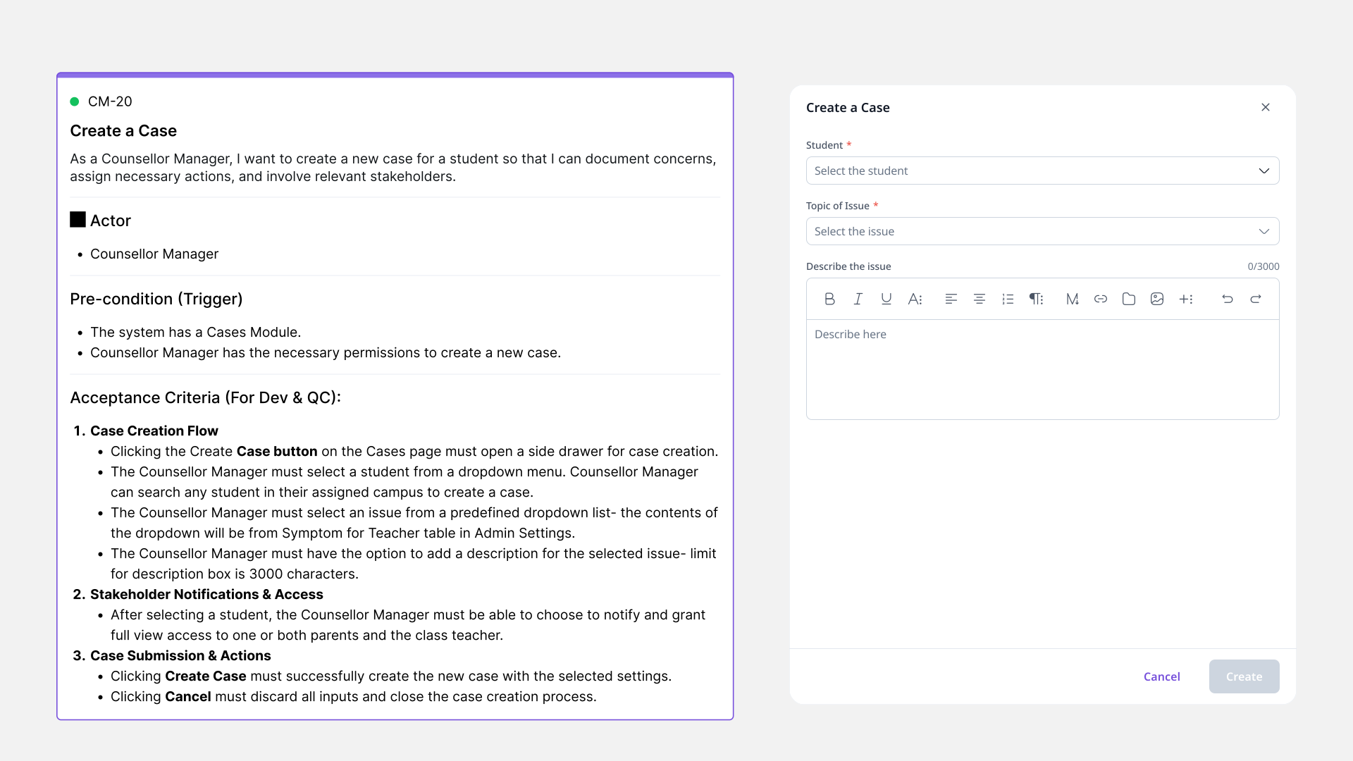
“The flows looked complete on the surface — but the moment you followed a real user through an edge case, they fell apart.”
Designing the Close Case Flow
A critical missing piece — ensuring cases reach a proper resolution
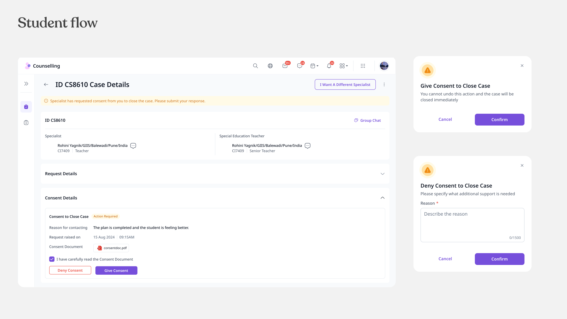
One of the biggest gaps I uncovered: there was no way to formally close a case. Cases could be opened and managed, but there was no defined end state — meaning cases lingered indefinitely with no way to tell what was resolved and what wasn’t.
I designed this flow from scratch. Closure isn’t just a button — it’s a checkpoint. All sessions must be complete, documents finalized, and the student must confirm their concerns were addressed. If any condition isn’t met, the system blocks closure and surfaces exactly what’s still pending. When a student doesn’t give consent, the flow ensures their voice remains part of the resolution rather than letting the case close silently.
Tracking Case Requests Across Roles
Giving non-counsellor roles visibility into the cases they raise
Any non-counsellor role can raise a case request, but only the counsellor manager decides whether it becomes an actual case. I designed a mini dashboard with a table view of all submitted requests and their status — so requesters are never left wondering whether their concern was heard.
Getting It Out the Door
From Figma to production — and staying until it shipped right
Handoff wasn’t a one-time event. I annotated every flow with logic and decisions, added all flows to Monday.com to give the dev team a structured build sequence, and walked them through the designs live.
But designs don’t survive first contact with code. I stayed on for two months post-handoff, conducting UI audits to catch where the design was getting lost in translation — and working directly with devs to course-correct before things shipped. The goal was simple: what we designed is what the counsellors get.
> Annotated flows with logic and decisions
> Structured build sequence on Monday.com
> Two months of UI audits post-handoff
By the Numbers
The impact of auditing, designing, and shipping
Flows documented & handed off
150+
Missing flows identified & added
15
Edge cases resolved
25
UI audit issues caught before shipping
90%
What I Took Away
CounselSync has shipped and is currently rolling out to schools. Here’s what this project taught me:
Ramping up is a skill in itself. I learned to build understanding through action — creating flow diagrams and annotations instead of waiting for perfect context.
Documentation is a design tool. What I created for my own understanding became the backbone of the dev handoff. Investing early paid off twice.
Real collaboration isn’t recurring meetings. Being embedded in the dev team’s Google Chat space meant quick answers in minutes, not days. Shipping well meant being present, not adjacent.
“Bhagyashree really went all out to ship this module”
— Agency Lead

